

1. The 90% Reality
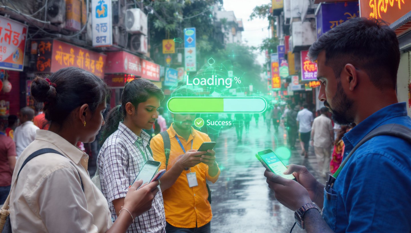
By 2026, data from Kolkata’s digital hubs shows a startling trend: over 92% of local e-commerce transactions are completed on a mobile device. While you might be looking at your website on a big iMac in your Salt Lake office, your customer is looking at it on a 6-inch screen while waiting for an auto-rickshaw in the rain.
- The “Desktop Legacy” Problem: Sites designed for desktop first are heavy, cluttered, and rely on precise mouse clicks. On a phone, those precise clicks become “Fat Finger” errors, leading to abandoned carts.
2. Elements of a “Mobile-Only” Strategy
A. The “Thumb Zone” Architecture
In 2026, we design for the thumb. Most users hold their phone with one hand.
- The Rule: The most important buttons (Buy Now, Contact, Menu) must be in the bottom third of the screen.
- The Change: We’ve moved away from “Hamburger Menus” at the top left (the hardest place to reach) to Bottom Navigation Bars, similar to Instagram or Spotify.
B. The “3-Second or Goodbye” Rule
With 5G becoming standard in Kolkata by 2026, expectations for speed have reached a breaking point.
- Technical Reality: If your site takes more than 2 seconds to load on a mobile connection, Google’s Core Web Vitals will push you to page 2 of the search results.
- The Solution: Use Next-Gen Image Formats (WebP/AVIF) and “Lazy Loading” so that only what the user sees on their screen is loaded initially.
C. Frictionless Checkout (The “One-Tap” Goal)
In 2026, nobody wants to type their 16-digit card number or their full address in Behala while standing in a crowd.
- The Standard: Your mobile site must support UPI Intent, Apple Pay, and Google Pay.
- Address Autocomplete: Use Google Maps API so the customer only has to type their house number, and the rest is filled in automatically.
3. PWA: The Middle Ground Between Web and App
Many Kolkata SMEs think they need a costly “App.” In 2026, they actually need a Progressive Web App (PWA).
- What it is: A website that acts like an app.
- The Benefits: * Customers can “Add to Home Screen” without downloading from the Play Store.
- It works offline or on weak 3G/4G connections.
- You can send Push Notifications (e.g., “Your Pujo order is out for delivery!”) directly to their lock screen.
4. Designing for “Micro-Moments”
Mobile users in 2026 are “snacking” on content. They have 30 seconds between meetings or 2 minutes on the bus.
- Scannability: No long paragraphs. Use bold headlines and high-quality “swipeable” image galleries.
- Direct Action: Instead of a “Contact Us” page, have a floating WhatsApp button. In Kolkata, a 1-to-1 chat is the fastest way to turn a browser into a buyer.
5. Comparison: Mobile-First vs. Mobile-Only
| Feature | Mobile-First (Old Way) | Mobile-Only (2026 Way) |
| Navigation | Top-left menu icon. | Bottom-tab navigation. |
| Input | Standard forms. | Biometric/UPI/Voice input. |
| Images | Responsive resizing. | Mobile-specific assets (Vertical). |
| Speed | Optimized for Wi-Fi. | Optimized for 5G/Mobile Edge. |
6. Testing for the “Kolkata Real World”
Don’t just test your site in your office.
- The “Field Test”: Take your phone to a crowded area like Howrah Station or Burrabazar where the network is congested and people are bumping into you. If you can’t navigate your own site comfortably there, it’s not “Mobile-Only” yet.
7. FAQ: Mobile-Only Transitions
- Q: Does “Mobile-Only” mean my site will look bad on desktop?
- A: Not at all. It means the desktop site will look like a “grown-up” version of the mobile site—cleaner, faster, and more focused. Think of it as “elegant minimalism.”
- Q: Is a PWA better than a native app?
- A: For 90% of businesses, yes. It’s cheaper to build, easier to update, and doesn’t require the user to go to an App Store.
- Q: How do I know if my site is fast enough?
- A: Use Google PageSpeed Insights. In 2026, look specifically for the “Mobile” tab score. You should aim for 90+.
Conclusion: The Future is in Their Pocket
Your customers are moving. They are busy, they are on their phones, and they have zero patience for “slow and clunky.” By embracing a Mobile-Only mindset, you aren’t just following a trend; you are respecting your customer’s time and reality in 2026.
At our Alipore studio, we build “Pocket-First” experiences. We’ll audit your current site and show you how to strip away the “desktop clutter” to create a high-conversion mobile machine.
Is your site a “Desktop Dino”?
Sign up for a “Mobile Performance Audit.” We’ll screen-record a “real-world” user trying to buy from your site on a phone and show you exactly where the friction is killing your sales.
