


1. The Death of the “Shrink-to-Fit” Strategy
For years, designers built for desktop and then used “Responsive Design” to stack elements for mobile. In 2026, this is backwards.
- The “Carry-On” Philosophy: Mobile-first design is like packing for a trip with only a carry-on bag. It forces you to prioritize. What is the one thing a customer in Salt Lake needs to see when they land on your page?
- The Performance Penalty: “Shrink-to-fit” sites often load heavy desktop code that the phone doesn’t need, killing your Core Web Vitals and your Google ranking.
2. Mapping the “Thumb Zone”
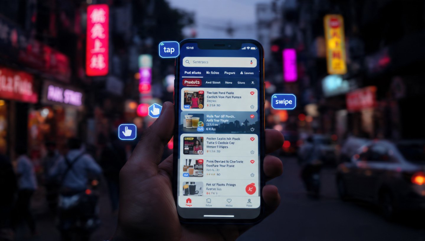
In 2026, we don’t design for “clicks”; we design for “thumbs.”
- The Reach Reality: Most users hold their phones with one hand. The top corners of the screen are the “Red Zone”—hardest to reach. The bottom-middle is the “Green Zone”—the most natural place for action.
- The 2026 Layout: Notice how the “Add to Cart” or “Call Now” buttons on the best Kolkata sites are now “sticky” at the bottom of the screen? That’s not a coincidence; it’s ergonomics.
3. The Technical 2026 Baseline
| Feature | 2026 Mobile Requirement | Why? |
| Tap Targets | Minimum 48×48 pixels | To prevent “fat-finger” errors where users click the wrong link. |
| Typography | Minimum 16px-18px body text | To ensure readability without “pinch-to-zoom” in bright sunlight. |
| Loading Speed | Under 2.5 seconds (LCP) | Mobile users in 2026 have zero patience. Slow sites are abandoned. |
| Input Fields | Auto-fill & Large Fields | Typing on a glass screen is a chore; make it as easy as possible. |
4. Designing for “Micro-Moments”
Mobile users in Kolkata aren’t usually sitting in a quiet office. They are:
- On a crowded metro at Esplanade.
- Waiting for a friend at College Street.
- Half-watching TV while scrolling.
- The Strategy: Your content must be scannable. Use short paragraphs, bold headers, and high-impact visuals. If they can’t understand your offer in 5 seconds, they’re gone.
5. Beyond Responsive: The “Adaptive” Shift
By 2026, we’ve moved beyond just “Responsive” (fluid grids) to Adaptive Design.
- Device-Aware Content: An adaptive site knows the user is on a phone and might swap a heavy 3D video for a fast-loading high-res image to save data and battery.
- Gesture-First: Use swipable galleries instead of tiny “Next/Previous” buttons. Mobile users want to swipe; it’s the natural language of the 2026 web.
6. Mobile-First Indexing: Google’s Final Word
It’s no longer a suggestion. Google now uses the mobile version of your site to determine your rank for both mobile and desktop searches.
- The Risk: If your mobile site is “lite” and missing the SEO text found on your desktop version, you will lose ranking power across the board.
- The 2026 Rule: Content parity is essential. Your mobile site must be just as informative as your desktop site, just better organized.
7. FAQ: The Mobile Transition
- Q: Does “Mobile-First” mean my desktop site will look bad?
- A: Quite the opposite. When you design for the constraints of mobile, your desktop site becomes cleaner, faster, and more focused. Simplicity scales up beautifully.
- Q: Should I build an App instead of a website?
- A: In 2026, unless you need deep hardware access (like the camera or GPS constantly), a Progressive Web App (PWA) is usually better. It looks and feels like an app but works in the browser without a download.
- Q: How do I test my site for mobile?
- A: Don’t just use a browser emulator. Pick up a real, mid-range Android phone and try to use your site while walking. If you struggle to click a button, your customer will too.
Conclusion: The Future is in the Palm of Their Hand
The desktop computer is becoming a “work tool,” but the smartphone is where life—and shopping—happens in 2026. For your Kolkata business, a mobile-first approach isn’t a technical choice; it’s a commitment to meeting your customers where they are.
At our Alipore studio, we don’t “adjust” for mobile. We build for it. We’ll help you map out a thumb-friendly, lightning-fast experience that turns casual scrollers into loyal customers.
Is your site frustrating your mobile users?
Request a “Mobile UX Audit.” We’ll record a real user trying to complete a purchase on your site via smartphone and show you exactly where they get stuck—and how to fix it.
