


1. The Mobile Battery Anxiety of 2026
In February 2026, the average resident of Kolkata spends over 6 hours a day on their smartphone. Between navigating the Kolkata Metro, using Hello! UPI for every purchase, and streaming local news, “Battery Anxiety” is a real consumer pain point. When a user clicks on your business website, and it triggers heavy animations or complex, multi-level “mega-menus,” their phone’s CPU spikes, and their battery percentage drops.
At our Alipore studio, we believe that Basic Website Designing should be respectful of the user’s hardware. Energy-efficient navigation isn’t just “simple”—it’s a competitive advantage that keeps users on your site longer.
2. How Menus Drain Energy (and How to Fix It)
Most people think “it’s just a menu,” but from a technical perspective, navigation is often the most resource-intensive part of a basic site:
- The “JavaScript Overload”: Traditional dropdown menus often rely on heavy scripts to animate. In 2026, we replace these with Pure CSS transitions that use 15-25% less GPU power.
- Hidden Complexity: Mega-menus that load dozens of images and links in the background waste data and energy. We use Lazy-Loading for Navigation, only fetching content when a user actually interacts with a specific section.
- The OLED Factor: Since most Kolkatans now use OLED screens, every bright pixel costs energy. We design navigation bars with “True Black” backgrounds, allowing the phone to literally turn off those pixels and save up to 60% battery during browsing.
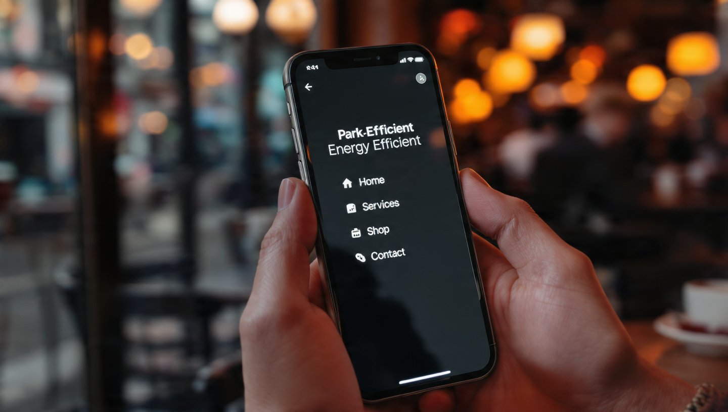
3. The “Thumb-First” Sustainable Layout
In 2026, “Simple” means “Efficient.” We follow the Rule of Four:
- Limit Top-Level Links: We restrict the main menu to the 4 most critical actions. This reduces “Choice Paralysis” and the energy spent by the user’s brain and their device.
- Strategic White Space: We use “Active White Space” (which is actually Dark Space in Eco-Mode) to separate links. This prevents “Fat Finger” errors, reducing the number of unnecessary page loads from accidental clicks.
- Visual Feedback without Bloat: Instead of heavy hover effects, we use subtle Micro-interactions—like a tiny color shift—that confirm a click without needing a full-screen refresh.
4. Comparison: Bloated Navigation vs. Energy-Efficient Navigation
| Feature | Legacy Navigation (2024) | Energy-Efficient Navigation (2026) |
| Logic | JavaScript-Heavy (Animations) | Pure CSS / Vanilla JS (Minimalist) |
| Visuals | Large Icons & Images in Menu | Text-First / High-Contrast Icons |
| Data Usage | Pre-loads all sub-menus | On-Demand Loading |
| Battery Impact | High (triggers GPU for motion) | Low (respects Power Saver modes) |
| User Intent | “Explore Everything” | “Find Exactly What You Need” |
5. Why “Simple” Wins the Search Engine War
Google’s 2026 algorithms prioritize Interaction to Next Paint (INP).
- Instant Response: Because simple menus have no heavy scripts to “hydrate,” they respond instantly to a user’s touch. This low latency tells Google your site is high-quality.
- Lower Bounce Rates: A customer in Gariahat trying to find your “Store Hours” will stay on a site that loads the menu instantly, even on a weak 4G connection near the market.
6. Use Case: The “Behala” Local Pharmacy
A neighborhood pharmacy in Behala wanted a site where seniors could quickly order medicines:
- The Problem: Their old site had a “Mega Menu” with 20 categories that crashed on older smartphones.
- The Redesign: We built a “Basic” site with a high-contrast, 3-button navigation: Order via WhatsApp, Upload Prescription, and Store Location.
- The Result: A 45% increase in mobile orders. Seniors found it easier to use, and they didn’t have to worry about the site “freezing” their phone.
- The Energy Win: The site’s energy footprint per visit was reduced from 2.1g to 0.4g of CO2, making it one of the “greenest” local sites in the city.
7. FAQ: Simplifying Your Navigation
- Q: “Will a simple menu make my brand look ‘cheap’?”
- A: No. In 2026, ‘Minimalism is the Ultimate Sophistication.’ Look at Apple or high-end Kolkata designers; they use fewer, more meaningful links to create an aura of confidence.
- Q: “How do I handle complex catalogs with a simple menu?”
- A: We use ‘Progressive Disclosure.’ The main menu stays clean, but we provide ‘Smart Filters’ on the product page itself. This keeps the navigation fast and the search targeted.
- Q: “Does this affect my SEO keywords?”
- A: Not at all. We place your secondary keywords in the footer or sitemap, which search engines read perfectly, while keeping the user’s view clean and efficient.
Conclusion: Respecting the User’s Hardware
In 2026, the best “Basic Website Designing” is invisible. It’s a site that works so smoothly and uses so little power that the user never has to think about their battery. By choosing energy-efficient navigation, you are telling your Kolkata customers that you value their time, their data, and their device’s health.
At our Alipore studio, we design websites that are light on the planet and even lighter on the battery.
Is your menu draining your sales?
Let’s do a “Navigation Efficiency Audit.” We’ll analyze your current menu structure and show you how a “Lean Navigation” strategy can speed up your site and make it the most user-friendly (and battery-friendly) option in West Bengal.