1. Why Color “Hits” Differently in Kolkata
Color isn’t universal; it’s cultural. While Western guides might say “White means purity,” in a traditional Indian context, it can carry different weights. In 2026, a brand in Ballygunge or Salt Lake must walk a tightrope between global “Modern Minimalism” and local “Cultural Resonance.”
When someone from Kolkata lands on your site, they decide within 90 milliseconds if they trust you. Most of that judgment is based on color alone.
2. The 2026 Palette Trends for Local Brands
We are seeing three dominant “Vibes” in the Kolkata market this year:
- The “Eco-Heritage” (Earth Tones): Inspired by Shantiniketan and the terracotta of Bishnupur.
- Colors: Muted Terracotta (#C18A63), Mustard (#FFCF36), and Sage Green.
- Best For: Boutiques, organic cafes in Hindustan Park, and sustainable lifestyle brands.
- The “Sector V Cyber” (Neon & Deep Tech): Reflecting Kolkata’s growth as an IT hub.
- Colors: Deep Navy (#0A1A3C), Electric Teal, and Neon Magenta.
- Best For: SaaS startups, AI firms, and gaming platforms.
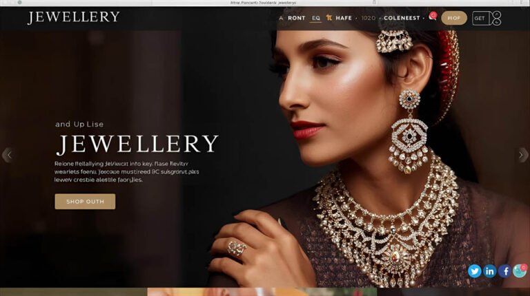
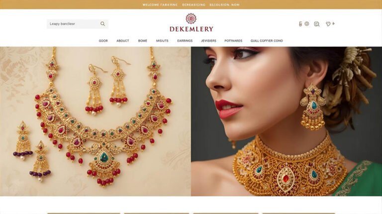
- The “Alipore Luxury” (Royal Neutrals):
- Colors: “Mocha Mousse” (Pantone’s 2026 Earthy Brown), Charcoal, and Matte Gold.
- Best For: Premium real estate, jewelry showrooms, and high-end consultancies.
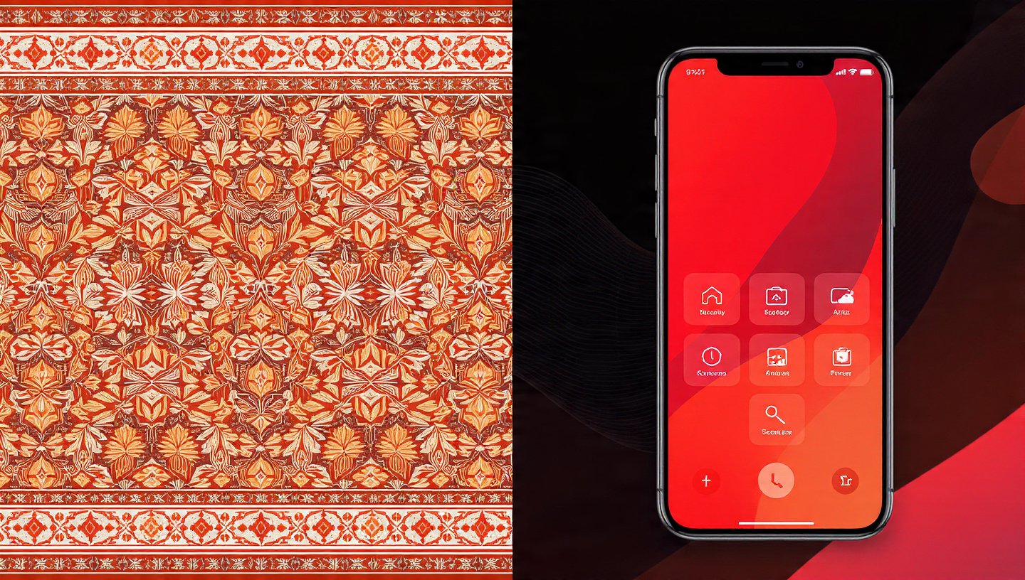
3. The 60-30-10 Rule (Design Like a Pro)
Don’t splash your primary color everywhere. In 2026, the most effective websites follow this ratio:
- 60% Primary (Neutral): Usually your background (White, Soft Grey, or a very light “Cloud Dancer” off-white). It gives the eyes “breathing room.”
- 30% Secondary (Brand): Your logo’s main color. Use it for headers, footers, and icons.
- 10% Accent (Action): A contrasting color (like a bright Orange or Electric Green) used only for your “Call to Action” (CTA) buttons.
[Image: A visual chart showing the 60-30-10 distribution on a sample mobile screen]
4. Emotional Triggers: What are you Selling?
| If you want to convey… | Use this Primary Color | Local Context Example |
| Trust & Stability | Blue | A bank in Park Street or a Hospital. |
| Energy & Urgency | Red | A food delivery app for Phuchka or Biryani. |
| Growth & Health | Green | An organic tea brand or an EV startup. |
| Luxury & Power | Black / Purple | An elite wedding planner or a boutique hotel. |
| Optimism & Warmth | Yellow / Orange | An ed-tech startup or a youth cafe. |
5. Accessibility: The “Missing Link”
In 2026, the Indian government’s digital guidelines (and Google’s ranking AI) prioritize Accessibility.
- The Red Flag: Using light grey text on a white background. It might look “sleek,” but it’s unreadable for many users, especially senior citizens in South Kolkata.
- The Fix: Always ensure a 4.5:1 contrast ratio. If your colors are too similar, your SEO will suffer, and your bounce rate will skyrocket.
6. Dark Mode: The 2026 Essential
Kolkata’s tech-savvy crowd loves “Dark Mode.” Your color palette must be Adaptive.
- When a user switches their phone to Dark Mode while riding the Kolkata Metro, your bright white background should gracefully transition to a deep charcoal, while your brand colors stay vibrant.
7. FAQ: Coloring Your Success
- Q: Can I use more than three colors?
- A: You can, but it’s risky. In 2026, “Visual Noise” is a conversion killer. Stick to 3 main colors and use varying “tints” (lighter versions) of those colors to create depth.
- Q: My logo is Red and Green; how do I make that look modern?
- A: Avoid the “Christmas” look. Use a very deep, almost black-green as your secondary and a bright, poppy red only for small accents.
- Q: How do I test my colors before launching?
- A: Use an AI tool like ‘Colormind’ or ‘Adobe Color.’ Or better yet, show a mockup to 5 people in Gariahat and ask them what “feeling” the colors give them.
Conclusion: Color is Your Brand’s “Voice”
Before a customer reads a single word on your website, your colors have already told them if you are expensive or affordable, traditional or modern, reliable or risky.
At our Alipore studio, we don’t just pick colors; we engineer “Visual Identities.” We look at your competitors, your target neighborhood, and the 2026 psychological trends to build a palette that doesn’t just look good—it sells.
Not sure if your current colors are working?
Ask us for a “Visual Sentiment Audit.” We’ll tell you exactly what your current palette is subconsciously saying to your customers and how to fix it for the 2026 market.